R語言散點圖
散點圖顯示了在笛卡爾平面繪製的多個點。每個點代表兩個變量的值。在水平軸上選擇一個變量,在垂直軸中選擇另一個變量。
簡單散點圖使用plot()函數來創建。
語法
在R中創建散點圖的基本語法是 -
plot(x, y, main, xlab, ylab, xlim, ylim, axes)以下是使用的參數的描述 -
- x - 是數據集,其值是水平座標。
- y - 是數據集,其值是垂直座標。
- main - 是圖表的標題。
- xlab - 是水平軸(
y軸)上的標籤。 - ylab - 是垂直軸(
y軸)上的標籤。 - xlim - 是用於繪製的
x的值的極限。 - ylim - 是用於繪製的
y值的極限。 - axes - 指示是否應在繪圖上繪製兩個軸。
示例
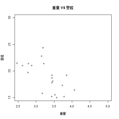
我們使用R環境中可用的數據集「mtcars」來創建基本散點圖,下面使用mtcars數據集中的「wt」和「mpg」列。參考以下代碼實現 -
input <- mtcars[,c('wt','mpg')]
print(head(input))
當我們執行上述代碼時,會產生以下結果 -
                    wt      mpg
Mazda RX4           2.620   21.0
Mazda RX4 Wag       2.875   21.0
Datsun 710          2.320   22.8
Hornet 4 Drive      3.215   21.4
Hornet Sportabout   3.440   18.7
Valiant             3.460   18.1
創建散點圖
以下腳本將爲wt(weight)和mpg(英里/加侖)之間的關係創建一個散點圖。
setwd("F:/worksp/R")
# Get the input values.
input <- mtcars[,c('wt','mpg')]

# Give the chart file a name.
png(file = "scatterplot.png")

# Plot the chart for cars with weight between 2.5 to 5 and mileage between 15 and 30.
plot(x = input$wt,y = input$mpg,
   xlab = "重量",
   ylab = "里程",
   xlim = c(2.5,5),
   ylim = c(15,30),
   main = "重量 VS 里程"
)

# Save the file.
dev.off()
當我們執行上述代碼時,會產生以下結果 -
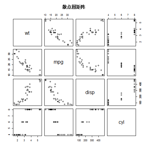
散點圖矩陣
當我們有兩個以上的變量,並且想要找到一個變量與其餘變量之間的相關性時,我們使用散點圖矩陣。可通過使用pairs()函數來創建散點圖的矩陣。
語法
在R中創建散點圖矩陣的基本語法是 -
pairs(formula, data)以下是使用的參數的描述 -
- formula - 表示成對使用的一系列變量。
- data - 表示將從中採集變量的數據集。
例子
每個變量與每個剩餘變量配對。下面爲每對繪製散點圖。
setwd("F:/worksp/R")
# Give the chart file a name.
png(file = "scatterplot_matrices.png")

# Plot the matrices between 4 variables giving 12 plots.

# One variable with 3 others and total 4 variables.

pairs(~wt+mpg+disp+cyl,data = mtcars,
   main = "散點圖矩陣")

# Save the file.
dev.off()
當我們執行上述代碼時,會產生以下結果 -