Python圖表樣式
在python中創建的圖表可以通過使用用於製圖的庫中的某些適當方法進一步設置樣式。 在本課中,我們將看到註釋,圖例和圖表背景的實現。 我們將繼續使用上一章中的代碼並對其進行修改以將這些樣式添加到圖表中。
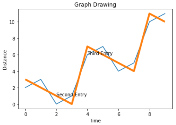
添加註釋
很多時候,我們需要通過突出顯示圖表的特定位置來對圖表進行註釋。 在下面的示例中,我們通過在這些點上添加註釋來指示圖表中值的急劇變化。
import numpy as np
from matplotlib import pyplot as plt

x = np.arange(0,10)
y = x ^ 2
z = x ^ 3
t = x ^ 4
# Labeling the Axes and Title
plt.title("Graph Drawing")
plt.xlabel("Time")
plt.ylabel("Distance")
plt.plot(x,y)

#Annotate
plt.annotate(xy=[2,1], s='Second Entry')
plt.annotate(xy=[4,6], s='Third Entry')
執行上面示例代碼,得到以下結果 -
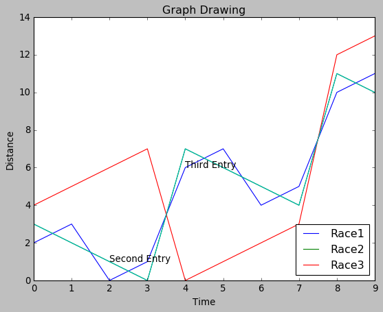
添加圖例說明
有時需要繪製多條線的圖表。 圖例的使用表示與每條線相關聯的含義。 在下面的圖表中,我們有3條適當的圖例。
import numpy as np
from matplotlib import pyplot as plt

x = np.arange(0,10)
y = x ^ 2
z = x ^ 3
t = x ^ 4
# Labeling the Axes and Title
plt.title("Graph Drawing")
plt.xlabel("Time")
plt.ylabel("Distance")
plt.plot(x,y)

#Annotate
plt.annotate(xy=[2,1], s='Second Entry')
plt.annotate(xy=[4,6], s='Third Entry')
# Adding Legends
plt.plot(x,z)
plt.plot(x,t)
plt.legend(['Race1', 'Race2','Race3'], loc=4)
執行上面示例代碼,得到以下結果 -
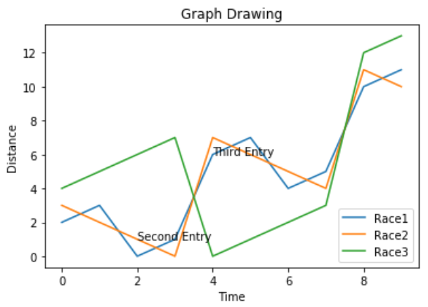
圖表演示風格
可以使用style包中的不同方法修改圖表的表現風格。
import numpy as np
from matplotlib import pyplot as plt

x = np.arange(0,10)
y = x ^ 2
z = x ^ 3
t = x ^ 4
# Labeling the Axes and Title
plt.title("Graph Drawing")
plt.xlabel("Time")
plt.ylabel("Distance")
plt.plot(x,y)

#Annotate
plt.annotate(xy=[2,1], s='Second Entry')
plt.annotate(xy=[4,6], s='Third Entry')
# Adding Legends
plt.plot(x,z)
plt.plot(x,t)
plt.legend(['Race1', 'Race2','Race3'], loc=4)

#Style the background
plt.style.use('fast')
plt.plot(x,z)
執行上面示例代碼,得到以下結果 -